
8 Essential Tips For Writing Fantastic Infographic Copy

Infographics are a common and popular way of spreading information across people in a short time. The correct usage of text and image educates the reader on various issues and topics. Everyone is preparing infographics today, and if you want your infographic copy to be unique, it’s not going to be easy at all.
Many marketers concentrate on the design aspect only, but equal attention must be given to the context as well. Here you can explore the essential tips for writing a fantastic infographic copy.
1. Create for your targeted audience

First of all, understand your target audience as it will help you come out with a killer infographic. The most viral infographics can target the right audiences. The common mistake done by people while creating infographics is they choose a common topic, but make sure you do not commit such faults.
2. A beautiful design
The design of the infographic should guide the viewers to understand what it wants to say. It needs to be designed to keep the audience, topic, and brand into consideration.
3. Keep it simple
The interesting part of the infographic is you have the freedom to design it as you like. There is no specific rule that you need to consider while creating them. But instead of creating complex infographics, it’s better to keep it simple so that audiences can understand them better.
4. Start with a catchy headline

A headline is the most important aspect of an infographic. If it’s not catchy, probably people will not prefer to go beyond that. The headline can be funny, plain, clever, etc., something that gives a hint to the viewer about the entire infographic.
5. Maintain the focus

Do not make your infographic complicated by incorporating figures, facts, and everything. It’s better to maintain the focus on a single topic so that your objective of targeting your clients is satisfied.
6. Introduce the subject
Sometimes people start writing long infographics and the main objective gets lost. Remember that when your introduction starts exceeding 200 words, you need to edit it. The subject should complement the visual elements and should not look separate from that.
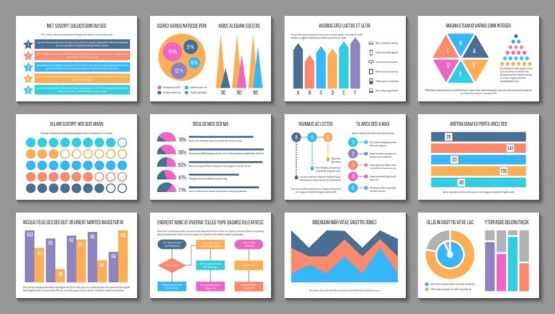
7. Try to show things visually.

If possible, it would be better to show things visually. People feel more attracted by looking at visual information and prefer to read. A good balance of visuals and context can make your infographic look the best.
8. Easy to view
Suppose you have spent hours preparing an infographic, but after that, when you decrease the size, the readability gets affected. That’s why; it’s important to keep every aspect into consideration while designing. You must reduce the size of the infographic at the start so that you do not need to do it again. Therefore, the readability also does not get affected in the end.
Signing off!
Infographics are everywhere now, and you need to really come up with something unique to create an impression among the audience. If your viewer can understand what your infographic wants to say, you are successful in creating it.


Post a Comment